The Impact of Data Visualization on SaaS Metrics

Navigating the complexities of SaaS metrics can be daunting, but data visualization offers a robust solution. By converting raw data into clear and engaging visuals, you can swiftly identify trends and make informed decisions. Interactive dashboards, for example, can significantly ease the monitoring of key performance indicators (KPIs).
Nevertheless, the effectiveness of data visualization hinges on certain elements that can either enhance or impede comprehension. Therefore, what factors should you prioritize to fully leverage the power of data visualization in your SaaS strategy?
Understanding Data Visualization
Data visualization simplifies complex datasets into intuitive graphics, enabling quick comprehension of significant insights. In the realm of SaaS, effective data visualization is paramount for enhancing user experience. By employing interactive dashboards, you can seamlessly monitor key performance indicators (KPIs). These visuals make it easier to identify trends and anomalies that might otherwise be overlooked in raw data formats.
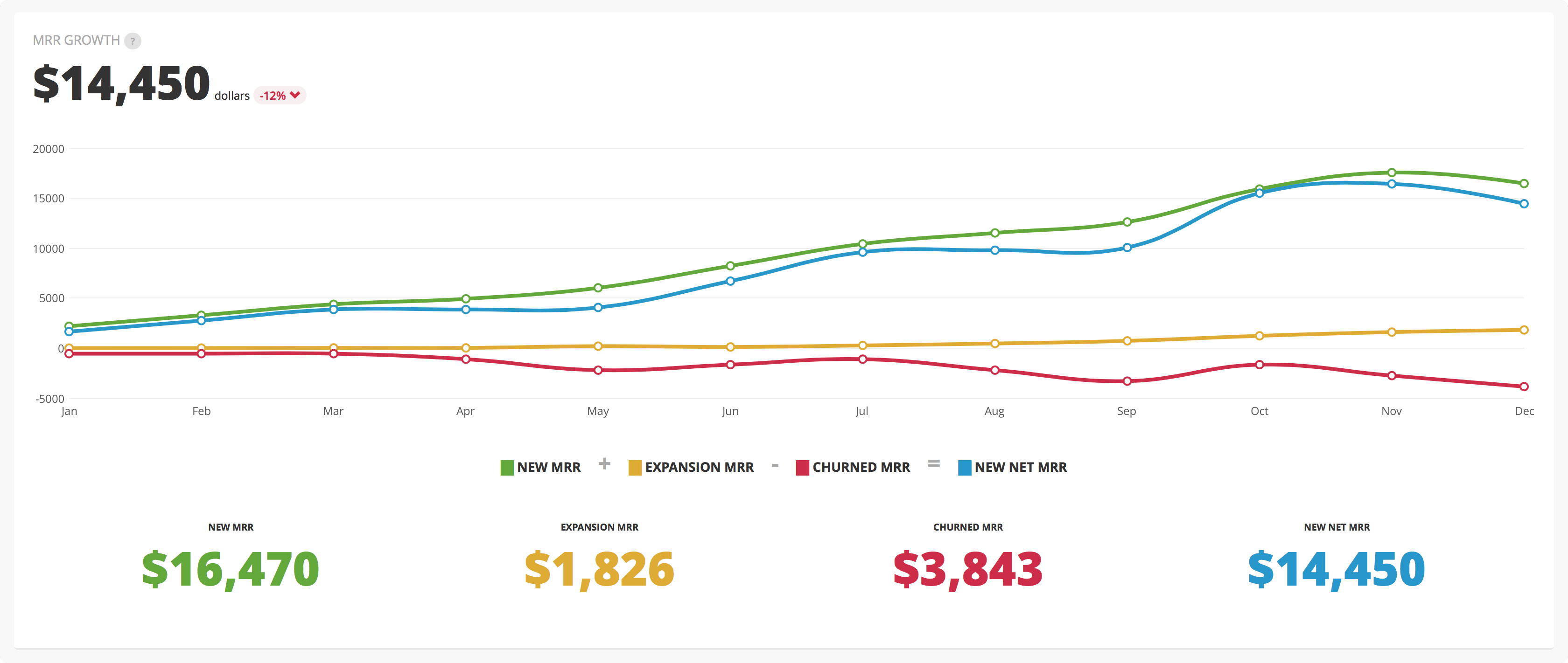
Engaging with effective data visualization facilitates informed decision-making. Since the brain processes images faster than text, you can act on visual data presentations more swiftly. Whether you're tracking Monthly Recurring Revenue (MRR) or customer retention rates, visuals offer a clear depiction of your SaaS metrics. Incorporating clear labels and contextual information in your visualizations is essential. This ensures that even the most complex data sets are communicated accurately.
Exploring the landscape of data visualization reveals that it not only presents information but also transforms your interaction with data, leading to smarter decision-making. Embracing data visualization empowers you to navigate your metrics' complexities with confidence and clarity.
Importance in SaaS
Effective data visualization is crucial in SaaS as it enables rapid identification of trends and informed decision-making based on key performance indicators. Utilizing visual tools can enhance your comprehension of metrics like Monthly Recurring Revenue (MRR) and customer acquisition rates. This not only aids in spotting anomalies but also helps generate actionable insights that drive strategic initiatives.
Adopting effective data visualization can significantly boost user engagement. Presenting complex data in an interactive format can lead to a 64% increase in quick decision-making among users. Additionally, real-time monitoring of user engagement metrics allows for swift responses to customer needs, ultimately enhancing satisfaction and retention.
Clear visual insights into financial performance also foster transparency and trust among stakeholders. This transparency is essential for building long-term business relationships in the SaaS space.
By reducing the time spent on data analysis by up to 80%, you can focus on what truly matters—growing your business and innovating your offerings. Embracing data visualization is a game-changer for any SaaS company aiming for success.
Steps for Effective Visualization

To create impactful visualizations in SaaS, start by defining the purpose and identifying the key insights you want to communicate. This ensures your visualizations directly align with the metrics that matter. Next, understand your target audience. Tailor your visualization style to their demographics and knowledge level for better engagement.
Here are some steps to follow:
- Choose the right data visualization tools that can effectively represent your data.
- Implement a consistent color palette that enhances clarity and is accessible to all viewers.
When you focus on these elements, you'll tell compelling stories through your data. The representation of data will facilitate a deeper understanding, guiding stakeholders in their analysis.
Choosing Visualization Types
Choosing the right type of visualization can substantially enhance your ability to convey data insights clearly and effectively. When analyzing SaaS metrics, selecting appropriate visualizations is crucial for delivering your message accurately.
For instance, bar charts are excellent for comparing categorical data, while line graphs are ideal for displaying trends over time. If your goal is to illustrate percentage distributions among categories, pie charts can be useful; however, avoid using too many segments, as this can lead to confusion.
Scatter plots are invaluable for displaying relationships between two continuous variables, helping you identify correlations and outliers relevant to your metrics. Heat maps are particularly effective for visualizing user engagement across different features or time periods, quickly highlighting areas that may require attention.
Additionally, dashboards that integrate multiple visualization types can provide a comprehensive view of your key performance indicators (KPIs). This multifaceted approach facilitates faster decision-making and enables you to adjust strategies efficiently, ensuring that your data visualization efforts yield meaningful insights and drive success.
Effective Use of Color

Using color effectively in data visualizations significantly enhances clarity and comprehension. By understanding color association principles and ensuring accessibility, you can create visuals that are engaging and easy to interpret.
Let's explore how to implement these strategies in visualizing your SaaS metrics to ensure semantic accuracy, completeness, and consistency. Additionally, we'll cover how to maintain semantic conciseness, relevance, interoperability, and trustworthiness throughout your visualizations.
Color Association Principles
Effective use of color in data visualization can significantly enhance user understanding and engagement. Thoughtful application of color association principles can improve the clarity of your data and facilitate quicker decision-making.
Here are some key aspects to consider:
- Familiar Color Associations: Use colors that users already recognize, such as red for warnings and green for positive outcomes, to improve comprehension.
- High-Contrast Colors: Utilize high-contrast colors to ensure accessibility for all users, including those with color blindness.
Enhancing Visual Clarity
Using a well-chosen color palette can significantly enhance visual clarity in data visualizations, making it easier for viewers to interpret SaaS metrics quickly. Effective color schemes help distinguish between data points, allowing you to highlight trends and categories within your dataset. Consistent use of colors enhances visual coherence, which is crucial for improving comprehension among stakeholders.
High-contrast colors can greatly increase legibility, reducing cognitive load and ensuring users can focus on key data points. Familiar color associations—such as red for negative trends and green for positive—facilitate quick understanding, enabling stakeholders to grasp essential insights rapidly.
A thoughtful approach to color not only makes visualizations more engaging but also more intuitive. Appropriate color choices can guide viewers through complex data, helping them connect the dots without being overwhelmed by visual clutter. Prioritizing visual clarity empowers your audience to make informed decisions based on the presented metrics, ultimately driving better outcomes in your SaaS initiatives.
Accessibility Considerations
Accessibility in data visualization requires thoughtful color selection to ensure all users can accurately interpret the information. Given that approximately 1 in 12 men and 1 in 200 women are colorblind, choosing appropriate color palettes is essential.
Here are some key points to enhance accessibility:
- Use high-contrast color combinations to improve visibility and legibility for users with different visual abilities.
- Maintain visual coherence by applying consistent color associations, such as red for negative trends and green for positive ones, to facilitate data comprehension.
These practices help create inclusive data visualizations that are accessible to a broad audience.
Enhancing Data Storytelling
Transforming complex SaaS metrics into compelling narratives can significantly enhance your data storytelling efforts, making insights more relatable and actionable for your audience.
Leveraging data visualization techniques allows you to effectively highlight key metrics such as Monthly Recurring Revenue (MRR) and customer acquisition rates. Visual elements like charts and graphs help your audience quickly grasp crucial information and discern trends.
Incorporating customer insights through personas and case studies personalizes your narrative, fostering emotional connections that boost engagement. When your audience relates to the data, they're more likely to understand its implications and respond effectively. This visual storytelling approach not only drives action but also identifies growth opportunities and areas needing improvement in real-time.
To amplify impact, regularly update your data stories to reflect the latest performance metrics. This ensures your narratives remain relevant and facilitate ongoing discussions.
Challenges in Data Visualization

Navigating the challenges of data visualization is essential for effectively communicating critical SaaS metrics. Awareness of common pitfalls ensures your visuals enhance understanding rather than hinder it. Misleading data presentation can distort information, leading to poor decision-making. Additionally, visual clutter from overly complex designs can confuse your audience, making clarity crucial.
Consider these key challenges:
- Data Overload: Excessive visuals can overwhelm users, making it difficult to focus on key metrics.
- Skilled Personnel: Creating effective visuals often requires specialized skills that may not be readily available in-house.
To overcome these challenges, prioritize simplicity in your designs, focus on clarity, and invest in training for your team.
Conclusion
In conclusion, utilizing data visualization can significantly enhance your comprehension of SaaS metrics. By converting complex datasets into clear, intuitive visual representations, you can swiftly identify trends and make well-informed decisions.
It's crucial to select appropriate visualization types, use color strategically, and emphasize storytelling to engage your audience effectively. Despite the challenges, overcoming them will lead to higher customer satisfaction and better business outcomes. Embrace data visualization to unlock the full potential of your SaaS metrics!
Related posts